Wednesday, April 25, 2012

Damini & Akshay

Weddings are always fun things! And there was a wedding in the family recently and due to 'my busy college schedule' I was unable to make it.

The person who was getting married was my sister's husband's sister (it sounds distant, but is very close) and she is one of the coolest persons I know! Her husband is equally fun and genius-ey. (If thats a word) :D

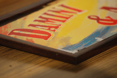
For them, I had decided earlier itself that I would make a nameplate, I wanted to give the printing bit a shot as well as see how I could challenge myself to this task. I decided to go in for a Bollywood Theme for this, because they are fun and colourful people!

I wanted to explore the idea of lettering myself and giving it a feel of a movie name. Due to time constraints, I wasn't able to do the practical application of this exercise, but did a digital rendering of the same.

The final design was printed on an A3 thick, glossy card sheet (300 GSM), cut into its size, laminated with a matt finished and framed with a black wooden border. This effect made it look exactly how I wanted it too, not bold and yet bot too subtle.

A pretty cool end project and a wonderful learning experience!


Photographs of the actual nameplate


Ma, holding the nameplate! 


My best wishes to the newest funnest couple! Have a suppperrrrbb time!


Colour for this chappal: Yellow , red and blue!

Monday, April 23, 2012

The Army Wives' Diary

Since I'm home these summer holidays, I decided to stay at home and relax. Until my Mum told me that there was going to be a social evening at the club in the town where Im currently residing in.

After a lot of hestitation and pestering I agreed to join in. I dont remember the last time I performed something, so I was kind of scared. But this proved to be a gala fun time for me.  The play was titled 'The Army Wives' Diary' and was a fun take on the different stages and phases that an Army wife goes through. There was drama and a lot of humour. I enjoyed myself thoroughly during the event.

Most participants were Army Wives themselves and wanted to have a lot of fun during this play. It was decided that the play would be all fun based and different roles and characters were assigned. I was asked to shake a leg and help out here and there. After what seems like years, I danced in public, with proper steps and chereography. I dont remember the last time I had so much fun!

I also volunteered to do some sort of publicity and handle their art direction. For funs sake, I made a couple of teasers and poster (after a full fledged photoshoot) for the event. These were sent out as circulars and got good a pretty good response. The photoshoot was also a whole lot of fun, with kids and aunties giving me some wonderful poses!

Since the play was a lot of drama, for the end, I thought it would be different and fun to have a proper credit sequence, so with prior permission, I started to build on that as well. I clicked candid shots, edited and added music and compiled it together. It was an amateur attempt at a credit sequence, but it did work finally!

The play was staged on last saturday and got a huge response and even a standing ovation! People enjoyed it and I did too.

I had a wonderful experience and enjoyed every bit.


The Teasers and Posters


The End Credits Sequence


Colour for this chappal: Pink, Yellow and Green

Tuesday, April 10, 2012

Indian Woman- Symbol Design


The Noun Project  is an open source project that allows one to submit as well as use icons for words and nouns. Its a wonderful initiative and I felt I could have contributed somehow to this. I made an icon for 'Stress' that I designed during the Visualising Marathon 2012 and decided to put it up on the project.


While working one day, I subconsciously drew a symbol that looked like an Indian Woman. Although it represents an ideal Indian Woman, I felt it was one of the better and more recognizable ways to identify with the Indian Woman.  But after an almost interrogation session with a classmate who believed it didn't look like what an Indian Woman looks like, anymore and always, I chose not to put it up.

As a designer, I feel we work on stereotypes and what one identifies with best. To me, its an idealistic representation of an Indian woman and the most recognizable form.

Some other day when Im confident enough, maybe I will put it up.

If you're reading/seeing this, do let me know what you think and what works for you. I will appreciate the help!


Indian Woman
(Suggested icon, unpublished)


Stress Icon
(available on The Noun Project)


Colour for this chappal: Black (and red)

Sunday, April 1, 2012

One Paged Poem Illustrations

For poem illustrations in the Word and Image course, initially I had done one page illustrations, post which we had to move on to booklets, for 'It Isn't Time Passing'  and 'Lone Fox Dancing' , both by Ruskin Bond. This was immensely satisfying and gave me enough confidence to move ahead, terms of ideas.

Here's what I had done, these are scans of the original. A lot of colour and a lot of fun too!


Lone Fox Dancing


It Isn't Time Passing By


Colour for this chappal: Moonlight yellow and cream.