Wednesday, March 28, 2012

Documenting Quilting Bollywood

Earlier this semester when I did the Quilting Bollywood course as an Open Elective, I felt that there was a need for me to document the course experience and learnings. So I decided to do this in the form of a publication assignment, as also to learn Indesign. It was a good opportunity to do both.

So began the process of writing the content, thinking of an idea for the publication and then getting down to doing it finally. I was particularly inspired by this book I had once seen in the NID library and thought that it would be great to do something of that sort.

It didnt take me to long to create the content and the design for the publication. I slowly and steadily started to get the hand of Adobe Indesign and much to my pleasure, enjoyed it.

It was simple, plain and an attempt at being 'classic'. The document was printed on cartridge paper for a rustic effect. I enjoyed this self initiated project a lot. The publication was bound in the NID Print Labs and Im very grateful to them for their kind help, as always.


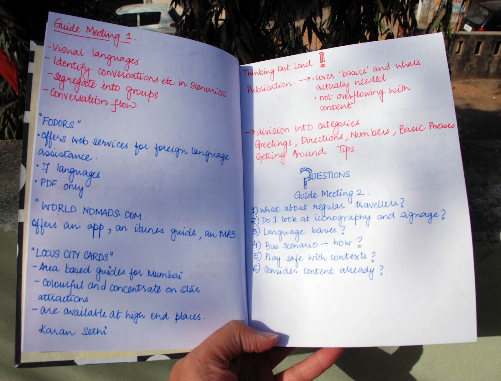
The only issue I felt was that the cover looked a little too simple, I probably will add something to it as soon as there is a little more time to get things done. Here are a few pictures of the printed and bound document.


 Regardless to say, I thoroughly enjoyed doing this!


Colourful for this chappal: Grey and red


Tuesday, March 27, 2012

QITM

The last course this semester at NID was a wonderful three week course called Elements of Moving Image. This course looked at animation basics and storytelling. One of the tasks during this course was to write a story and then convert it into a comic. I wrote my own story, called Q in the Mirror, based on of my best friends who I lovingly call Q. It is the story of Q, who one day cannot find his face in the mirror.

This was one of the first times I was attempting at something like this. I was extremely scared but gave it my best shot. After conceptualising and deciding on my frames, I began to build the comic. I initially made it black and white but after I went through, I realised that the colour didnt suit the character. So I moved to colours. I couldnt do a very decent job of this (in terms of skills), and the given time didn't allow me to finish the comic either. But the few pages I did, I made sure they looked consistent. I printed the pages on cartridge paper,which gives the entire feel of the comic as being soft and nurtured.

Here are a few pictures of the initial and the final comic book pages.

Initial Rough Drafts


Final Comic Book Pages (printed)


Colour for this chappal: Blue!


Monday, March 26, 2012

It Isn't Time Passing (Printed)

In one of my earlier posts, I had put up the web version (illustrated) of the poem, 'It Isn't Time Passing'. I finally got it printed, and it did turn out close to how I had imagined it, on mildly textured paper.
I quite like how its turned out. Here are a few pictures.


Colour for this chappal: Brown and Black and Textured!


Sunday, March 11, 2012

Project Diaries

For my on-going studio project, The Communication Survival Project, I was using a notebook that was in tatters (best if not shown) and I got some really strange looks from people when I opened it. I loved the notebook, but after pages started falling off,  I decided to make a fresh and new one for my first ever project! I happened to mention to Akshan, who gave me the definite "Ah yes, you SHOULD have a notebook"

I was sure I wanted a nice, thick, strong and hard cover diary. I hand bound the entire book, from stitching it to putting the cover, with the assistance of  my very helpful classmate Jasleen, and the Sachinbhai, of the Printing Labs at NID. The paper inside is executive bond and the cover is an old poster that was gathering dust in my shelf. Its of the very famous Kohinoor Typeface by the ITF. The reason why I chose this cover was because it did add a lot of stability and visual element,  since my project has a lot to do with languages and communication.

By the end of the entire process, it looked so nice to me that  I didnt want to write in it!

I also ended up making a small, centre stapled diary from the remains of the poster, to be used for notes and sketches. The pages of this diary are collected from old, one side used papers from different pads.


Thank you Jasleen for the last minute help!


The Diaries


The Main Dairy


The Inside Pages

Colour for this chappal: Black and White

Saturday, March 10, 2012

It Isn't Time Passing By

As part of the course Word and Image, we had to illustrate a poem and make a book form of it, I chose the Ruskin Bond poem 'It Isn't Time Passing'. My illustration idea was such that it looks like there are folds in the paper, because folded paper is associated with memories, on a personal note atleast.

The idea behind the narrative is to show a sort of comparison between time and the fact that you cant control it. Its almost like the narrator (the girl) is trying to hold on the birds but they fly away. A metaphor of the time she remembers is drawn with the birds. The style is simple, playing with lines that form patterns and textures.

This goes to print on midly textured paper.

A long due task I wanted to do, and do well.


Colour for this chappal: Brown

Thursday, March 8, 2012

Postmodernism in a Poster

Part of a course called 'Narrative Theory', at NID, as a final assignment we had the liberty to anything based on the theories we learnt during the one week course.  While the course was on itself, we noticed that there was hardly any representation of Graphic Design in the various eras that we studied. Akshan, Anupriya, Roshini, Deepti and I decided to make posters on these very theories we learnt, a representation of sorts, which would basically show how graphic designers must have thought then and further represented themselves.

Following the theme of, 'Graphic Design toh koi bhi kar sakta hai' meaning 'anyone can do graphic design' we chose different era's we wanted to work on. 

The poster I did was on post-modernism. To me, post-modernism was an era, where people broke out of structure and boundaries. It was all about breaking a code, expressing yourself and putting things together. More like a cut and paste of sorts.

My poster followed a collage theme, with alphabets taken from various styles of typography and a background of a newspaper.


Definitely not one of my best works, but this was a learning experience.

Colour for this chappal: black and white